|
Windows 8 Design Interface With Native WinRT XAML UI Controls
Perpetuum UI Controls for Windows 8 is
a set of UI controls that will help you develop
true Windows Store application faster.
The set offers 10 WinRT controls that will
add data input features to your applications and will
help to properly layout the controls. Build powerful
and visually attractive Windows UI applications
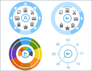
Radial Menu Control
Touch-centric radial menu will make complex hierarchical
menus be compact and intuitive. It provides smooth
gesture-based navigation and interaction with application
elements. It is usually used as a context menu and leaves more
free space for the application content.
|
|
|
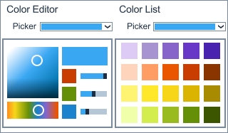
Color Picker
Perpetuum Color Picker adds the ability to
change color of the application components.
Pick color from the list or set color tone in
the color editor. Selecting colors is touch oriented
and habitual at the same time.
|
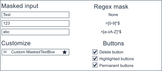
Text Box
In addition to the standard text input, Text box
adds the ability to insert specific items such as
buttons inside the text box. The control can validate
entered characters and allow only letters or only
digits or both. It’s possible to add any similar validation.
|
|
|
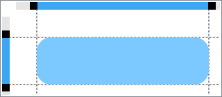
Plain Menu
Common flat menu control composed in a more compact way.
All nested menus are not thrown apart of main menu,
they appear instead, thus leaving more free space for
the application content. Getting back to the previous menu is just a single click.
|
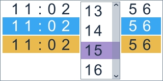
Time Picker
The component allows quick and convenient selecting
of time intervals with the help of two elements for
setting hours and minutes. Current time is set with a single click.
|
|
|
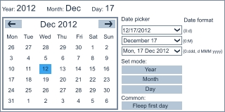
Date Picker
The component allows quick and convenient selecting
of date using the drop-down calendar control. Date format
can be changed to address your preferences of how
the date elements should be arranged (day/month/year).
|
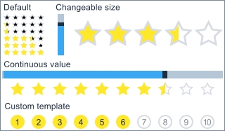
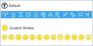
XAML Rating Control
Windows 8 rating control adds the ability to
rate some content in your application or application
itself, this is the easiest way to get feedback
from your customers. Size of the rating stars can
be adjusted or they can be changed to user-defined
elements (diamonds, smilies, etc.) to smoothly fit
into your application interface.
|
|
|
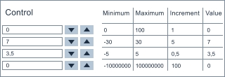
Numeric Box Control
Numeric box adds the ability increase or decrease
numeric value with a predefined step within a pre-defined
range using special buttons. It’s very useful
when users are to input some sensitive data.
|
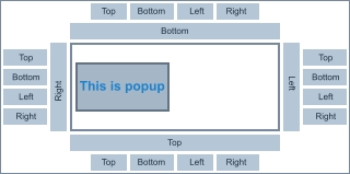
Flyout Control
Add advanced flyout menus to the target application
element. The control is customizable: you can set margins,
add user-defined UI element to the popup, precisely
position it on the left or right, top or
bottom or at any other application area.
|
|
|
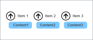
Expander
Expander control provides a way to provide
content to the users in an expandable area that
resembles a window and includes a header.
|
Accordion
An accordion control adds the ability to
organize the content into expandable panels.
When clicked, the panel makes the content
visible while the other panels are hidden.
It’s possible to add virtually any content to the panes.
|
|
|
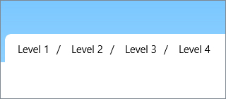
Breadcrumb
Breadcrumb control is a part of the navigation
that makes it easy to navigate the content.
It’s very convenient for the content with extremely
complicated and nested structure, since you get at
a glance idea of how many items are inside the definite
menu item and can always get back to the previous menu level.
|
Range Slider
An accordion control adds the ability to
organize the content into expandable panels.
When clicked, the panel makes the content
visible while the other panels are hidden.
It’s possible to add virtually any content to the panes.
|
|
|
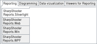
Tab Control
Tab control offers the ability to define multiple
pages for the same area of the application.
Tabs usually group information or controls based on their type.
|
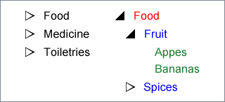
Tree View
Tree View control adds hierarchical view of
the information structured as tree with nodes.
It is especially useful to show document headings,
files and directories or any other hierarchic
structures. The control supports HierarchicalDataTemplate
that allows the creation of templates for hierarchical structures.
|
|
|
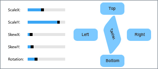
Layout Transformer
Layout Transformer helps developers easily
manage application content and controls:
buttons, text boxes, numeric boxes, etc.
It automatically layouts elements when
some modifications are done, for example, an element is rotated.
|
|