A list of gauge elements and their properties.
A gauge is a compound object with a hierarchical structure. Any available element can be included in the instrument.
The elements can be structurally divided into two groups: compound and simple.
Compound elements are elements that can include any other elements.
The elements can be functionally divided into visual and non-visual. Visual elements are intended for instrument
appearance assigning. Non-visual elements are intended for elements’ binding and grouping, as well as for assigning
instrument functionality.
The elements can be included in the gauge in different combinations.
The Instrument element
The Instrument element is the basis for gauge building.
The Size property is the size of the instrument work area.
The Enabled property indicates whether the instrument will react on the user actions.
The Focused property indicates whether the instrument is in the focus. During the instrument development these
values can be set arbitrarily. When the instrument is displayed in Widget, these properties are set according to
Enabled and Focused Widget properties.
These properties are intended to implement the instrument appearance and behavior depending on the state of the
Widget, in which the instrument is displayed.
The following properties are used only in the instrument design mode and saved with the instrument: SnapToGrid –
snap to grid, the ShowGrid property - the grid visibility, the GridStep property – the step of the grid, the
MeasureUnit property –the measurement units used.
The Joint element
|
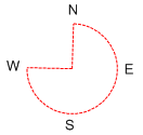
The Joint element is the trajectory in the line of an arc.
The arc is assigned by the center (the Center property), by the radius (the Radius property), by the starting angle
(the StartAngle property) and by the total angle (the TotalAngle property). The angles are counted clockwise, from
the horizontal axis. The Joint element is used for dials creation.
|
The Guide elelemt
|
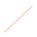
The Guide element is the trajectory along the line.
The line is assigned by the start (the StartPoint property) and the end (the EndPoint property) points. This element
is used for linear scales creation.
|
The Scale element
The Scale element is a non-visual element that assigns the range of scale value changes.
The range is assigned with the help of Minimum and Maximum properties.
For the scale visualization such elements as Ticks, NumericLabels and TextLabels are included into the Scale
element.
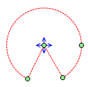
The Slider element
The Slider element is a non-visual element that assigns the current value (the Value property) on the scale, in
which this slider is included.
The Slider handles the events from the mouse in the following way: it synchronizes the Value property according to
the current position of the mouse pointer and the geometry of the trajectory, in which it is included. As the Slider
element is a non-visual one, it can not directly receive the events from the mouse. The events from the mouse are
passed to the Slider by the visual elements included in it. Thus, in order to make the Slider react on the mouse
moves, it is necessary to include some visual element in it.
The MaxLimit and MinLimit assign range of changing value and can process both absolute and relative values.
The UseLimit property defines if the assigned range of changing value is used.
Various visual elements, included in the Slider and bound to it by expressions, can be used for visualizing current
Slider value.
The Group element
The group element is a non-visual element used for grouping other elements.
The CustomLabels element
|
The CustomLabels element represents text labels on the scale that are not bound to scale values. Text labels as well
as corresponding scale values are assigned in the Labels collection.
Scale value can be assigned both by absolute value and relative value (in percentage from the scale range). Labels,
which value is set to Auto, will be evenly distributed along the scale subject to bench mark assigned by the Origin
property. Shift form the Scale is assigned in the Distance property.
The Dock property defines relative position of the CustomLabels element subject to sifts assigned in the Padding
property.
The OddLabelDistance property sets sift of add labels relative to even ones. Labels alignment relative to each other
is assigned by the Position property.
The TextAlingment property defines marks alignment relative to the corresponding scale value.
Text angle is assigned in the Angle property, and text orientation is set in the TextRotationMode property.
The ItemMargins property defines text shift from the label area margins.
The ShowSuperposableLabels defines if the superposable labels will be displayed.
If you need to display labels only in the specified range, use the MaxLimit and MinLimit properties assigning range
bounds.
The UseLimit property indicates that limitation of element output will be executed. This element should be included
in the scale.
|
The ScaleLabels element
|
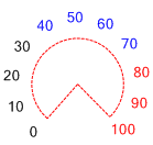
The ScaleLabels element represents numeric labels on the scale.
Values are displayed within the range, set in the scale, and step, defined by the Step property. If the Step
property is set to Auto, divisions’ amount is set in the Divisions property.
The Origin property defines a benchmark.
If the UseRoundValues is set to true, scale marks will be distributed along the scale in the way that the
corresponding values contain mimnal amount of fractional numbers; the number of divisions will be less or equal to
the Divisions property value. When the element is drawn, these labels will be evenly distributed along the
scale.
Shift from the scale is assigned by the Distance property.
The Dock property defines relative position of the ScaleLabels subject to shifts, assigned in the Padding property.
The OddLabelDistance property sets shift of the odd labels relative to even ones.
Labels alignment relative to each other is set in the Position property.
The TextAlignment property sets marks alignment relative to the corresponding scale value.
Label angle is set in the Angle property, and label orientation is set in the TextRotationMode property.
The ShowSuperposableLabels defines if the superposable labels will be displayed.
The ItemsMargins property defines text shift from the Label area bounds.
If you need to display Labels only within the assigned range, use the MaxLimit and MinLimit properties that set
range bounds.
The UseLimit property indicates that limitation of the element output will be executed. This element should be
included in the scale.
|
The ScaleTitle element
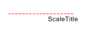
|
The ScaleTitle element represents the scale title.
Title text is defined in the Text property.
Element position is assigned is set in the Origin property.
The Dock property assigns relative position of the Scaletitle subject to shifts set in the Padding property.
|
|