The required condition for designing most chart types is the availability of two perpendicular axes, in line of which arguments and chart point values will be laid. Binding series to axes is executed by the ArgumentAxis and ValueAxis properties. Axis type doesn’t depend on its direction. But Argument axis is a horizontal axis, and Value axis is a vertical axis by default.
Axis is a scale, in line of which chart values are laid. Scale range is assigned by the MinValue and MaxValue properties, defining minimal and maximal scale values. Axis can automatically calculate scale range depending on taken series point’s values, using this axis. It is necessary to set the MinValue and MaxValue properties to Auto. If the MinValue and MaxValue take constant values, scale range is assigned by these values regardless of automatically calculated values. The MinValue and MaxValue can take relative value in percentage from the automatically calculated range. If automatic range calculation is used, range can be completely negative or completely positive. The StartFromZero property defines if the range will include the 0 point.
The IsDiscrete property specifies if axis will display discrete or numeric values. This property allows using axis as argument axis for series, containing nonnumeric values.
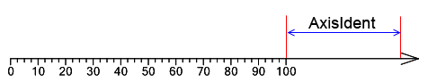
Axis is a vertical or horizontal line that can be stretched to fit the ChartArea height or width subject to sifts, assigned by the Margins property. Axis appearance is set by the Stroke and Arrow properties. Stroke sets type, color, and width of the line. Arrow assigns axis arrow type. Axis direction is set by the Direction and Reverse properties. The AxisIndent property sets distance between axis arrow and end point of the scale.
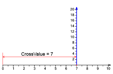
The CrossValue property assigns axis position relatively to the other axis, set by the PerpendicularAxis property.
The Chart ModelKit contains elements intended for displaying ticks, labels and other information on the scale.
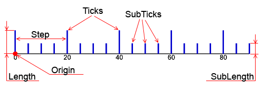
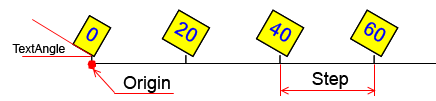
The Ticks element  is designed for displaying ticks on the scale. Ticks width is set by the Stroke property. Divisions step is assigned by the Step property. If Step is Auto, number of divisions is assigned in the Divisions property. The Origin property sets a bench mark for divisions. If the UseRoundValues property is set to true, scale ticks will be distributed in the way that the corresponding values contain minimal amount of the fractional numbers; the number of divisions will be less or equal to the Divisions property value. Ticks length is set in the Length property. In the range between ticks, sub-ticks are displayed. They divide this range in accordance with the SubDivisions property. Sub-ticks length is set in the SubLength property.
Ticks and sub-ticks relative position can be assigned by the SubTicksPosition property. When the element is drawn, ticks will be evenly allocated along the scale. The UseDicreteValue property is used for displaying ticks on the discrete scale. If this property is set to true, ticks will be displayed only for discrete scale values.
The ScaleMarks element  is intended for displaying scale marks. Mark type is set by the Shape property, mark size is defined by the MarkSize property. Sub-marks size is defined by the SubMarkSize property. Logic and properties, assigning marks position on the scale, are analogous to those of the Ticks element.
The ScaleLabels element  is designed for displaying axis values. If the axis is discrete, ScaleLabels will display discrete axis values. If the axis is non-discrete, labels will be displayed evenly along the scale. Divisions step is set by the Step property. If step is set to auto, number of divisions is assigned in the Divisions property. The Origin property assigns bench mark for divisions. If the UseRoundValues property is set to true, scale labels will be distributed in the way that the corresponding values contain minimal amount of the fractional numbers; the number of divisions will be less or equal to the Divisions property value. Label angle is set in the Angle property, Label orientation is set by the TextRotationMode. The Fill and Stroke properties set fill type and bounds of the area, occupied by the label. This area can be enlarged by the ItemMargins property. The ShowSuperposableLabels specifies if the superposable scale labels will be displayed.
The CustomLabels element  is similar to the ScaleLabels element, but it allows assigning arbitrary scale marks, not bound to axis values. Every label is assigned by the couple “text” – “scale value” and is stored in the Labels collection. If one or multiple labels contain the Auto value, such labels are evenly allocated on the scale.
The ScaleTitle element  is designed for assigning axis title. Label, set by the Text property, is located at the end of the axis.
The ScaleLabels, СustomLabels, and ScaleTitle elements feature several properties, assigning appearance and location of the labels. The OddLabelsDistance sets indent of odd labels relatively to even ones. The TextAlingment property assigns labels position in relation to the axis point, corresponding to the label value. The Position property sets labels position in relation to the highest label. The Formula property sets an expression for calculating label value, and the TextFormal property assigns string for label text formatting.
The Ticks, ScaleMarks, ScaleLabels, СustomLabels, and ScaleTitle elements feature a set of similar properties.
If there is the need to display axis elements only within the specified range, you can use the MaxLimit and MinLimit properties assigning range bounds. The UseLimits property specifies that limitation on elements display will be used.
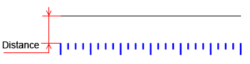
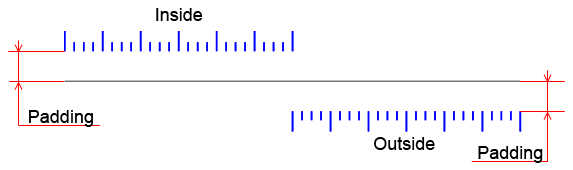
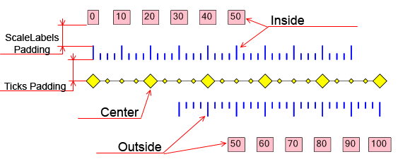
Elements shift from the scale is set by the Distance property. Often axis contains multiple scale elements, for example, Ticks and ScaleLabels. The Dock property assigns relative position of such elements. If the element’s Dock property is set to None, element’s position on the axis doesn’t depend on any other axis elements. In this case element’s position is defined by the Distance property value.
If the Dock property is set to Center, an element is positioned at the axis center, regardless any other axis elements. If the Dock property value is Inside, an element is located inside the axis at the distance, assigned by the Padding property. If the Dock property value is set to Outside, an element is positioned outside the axis at the distance, defined by the Padding property.
If the axis contains multiple elements, which Dock property value is not None, at first, elements with the Dock property value, set to Center, are positioned, and then all other elements are allocated on the axis in the order, they were added to the axis, subject to the size of already positioned elements.
The Colorizer property allows setting scale elements’ color. It is also possible to set color of all axis elements by assigning the axis Colorizer property.
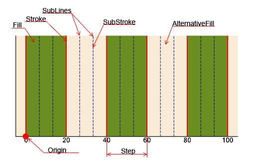
The GridLines element is designed for displaying values grid in the chart. Grid step is assigned by the Step property. If this property value is set to Auto, a number of divisions will be set by the Divisions property. The Origin property defines a bench mark. If the UseRoundValues property is set to true, scale labels will be distributed in the way that the corresponding values contain minimal amount of the fractional numbers; the number of divisions will be less or equal to the Divisions property value. Amount of sub-lines is set in the SubLinesCount property.
The Fill and AlternativeFill properties assign fill for alternate lines. The Stroke and SubStroke properties define type of Lines and Sub-lines.